eric zakariasson@ericzakariasson
here's a prompt to improve your agent harness based on what we've learned at cursor. enjoy
No matches
What this site is made of: the mark, the tokens, the type, the chips and the rules, drawn by the code that draws every other page.
My initials on a 16-unit grid, one stroke weight, every diagonal at the same angle. Nothing in it touches anything: the crossbar sits half a unit off the legs and the M sits half a unit off the A, a monogram held together by proximity rather than by contact.
It is also what makes the A separable, which is what the tab strip needs. At 16 by 16 the lockup has no fully inked pixel in it at all. Its strokes land at 0.81 device pixels and peak at 87% ink, against eighteen solid pixels for the A on its own. So the page and the social card get both letters and the favicon gets one, and the A lifts out whole rather than as a fragment.
 643216
The favicon at the three sizes a browser asks for. Its colours follow your browser’s light or dark setting, not the theme button in the footer, because it sits in the tab strip.
Every colour on the site is one of these. Light is the base. Dark is written twice: once for a reader following their OS, once for a reader who pinned it.
The values beside the swatches are read from the live stylesheet, so they follow the theme button in the footer. They’re the shipped strings, so the minifier has shortened some hexes to three digits and folded alpha in where it could.
The accent is one hue at two lightnesses. The hue is identical in both themes and lightness is the only difference, because no single lightness clears 4.5:1 against both a white page and a near-black one. Amber is the second accent. It marks things and is never a link.
The moment the accent becomes a background with text on it, it switches to the panel pair. White on the dark theme's accent is 3.89:1 and fails AA; white on this blue is 5.91:1 in either theme, which is why this block is the same blue whichever theme you are reading it in.
The palette row that sits under every screenshot in the gallery. Every swatch is a button that copies its hex. These six were measured off the Ghost screenshot.
Geist Sans for prose and labels, Geist Mono for data: dates, counts, clocks, hex values and code. Both are variable fonts served from this domain.
The masthead at the top of this page is the mono variant and the line under it is the standfirst, so two of those rows are already in front of you at full size, in the elements they normally ship as. The class called mono is the label voice, and it is not mono any more: 14px sans, weight 400, normal tracking, sentence case, for section heads, field labels, tabs and footer items. The titles are bold rather than big, and everything under them stays quiet.
Two rules are global and are not in the table because nothing sets them: every heading balances its line breaks and every paragraph gets the prettier ones. Both are declared once, for the elements, and no component redeclares them.
Mono is for what you might retype: a count, a clock, a hex, a key cap like esc, a token name. Inside a label the figure switches to mono by itself, because every figure already carries tabular numbers.
Text comes in four levels, and each piece of text is one of them. The fourth never carries a word; it draws the slash between crumbs.
Spacing runs on three numbers: 8px inside a group, 16px between groups, 40px between sections. On an entry page the title, its metadata and its one-line summary sit 16px apart, and the notes under them start a new section.
Tabular numbers are not optional. Any digit that changes in place, or sits in a column, gets them. Here is the same clock twice, the second one without.
Watch the right edge of the second one. Every time a digit changes width the whole string re-lays-out, which is a twitch in the corner of your eye on a page with forty dated rows on it.
A soft tint, never a solid fill, so twenty rows read as one page rather than as a traffic light. A tone sets three numbers and the tint, the hairline and the ink all derive from them, which is how light and dark stay in step without a second palette.
Every ink clears 6:1 over its own tint. Not over the page behind it: over the colour the tint actually composites to, which is the lower of the two numbers and the one you are subject to. Measuring against the page flatters every tone by about eight tenths of a point.
The tag is the one chip that is not a tint. A verdict and a status sit somewhere on a scale, and the fill is what says so; a library tag names a subject, and one subject is not better than another. So it takes no colour at all: a grey outlined box with the word in it.
The hue row is /sites by colour: the tag’s box with a dot where the word goes, and the count of sites after it. The families come off each capture’s stored palette at build time, greys and creams left out, so a site with no colour left is black and white. A dot is the one colour here held to no contrast bar, because a yellow dark enough for 3:1 on white is mustard; its hairline edge does that job. Press one to open the gallery filtered.
The monogram row is the site’s seven identity hues. A saved post on /library opens with the poster’s profile picture, or without one, a circle holding their initial, coloured by hashing their handle into one of seven slots.
Those are every verdict on /tools, every status on /experiments and every kind on /library, read from the same lists those pages use.
The chip--link row is the filter form: same tone, same size, plus a pointer cursor and a tint that deepens on hover. Hover one. That state holds AA rather than 6:1, the one place the vocabulary spends contrast on purpose.
Blue is the accent hue held back from the accent lightness, because an inline link and a shipped chip must not be the same blue on the same page. It is held back by two dials in the light theme and by lightness alone in the dark one, where nothing darker survives the tint.
A link inside a sentence is blue with a 2px underline in the same blue at 40%, like this one, and the line goes solid on hover. It stays at body weight: prose is near-black now, and a bold blue word in it shouts. The line is the cue that does not depend on seeing colour.
A link that leaves the site takes an arrow, drawn by CSS: rareui.com. It has an empty accessible name, so a screen reader announces the link and not “north east arrow” after it.
Everything else is exempt, and exempt structurally rather than by an override. The top bar, chips, footer items, index rows, tool and library rows, tabs and metadata strips are simply not in that rule, and each sets its own text-decoration: none. Underlining them would turn navigation into a paragraph of shouting.
Furniture that still has to read as a link uses the quiet pattern: it keeps its ink and carries a permanent underline in the hairline colour, going accent on hover. It looks like this. The underline is permanent because a touchscreen has no hover to reveal one.
Everything presses. The default is a 4% squeeze over 120ms, and wide elements dial it back rather than shrinking by 4%, because a full-width row losing 4% of its width reads as a glitch and not as a press. Hold each of these down.
They do nothing else.
Every transition names its properties. There is no transition: all anywhere, without exception, and an element that already presses does not get a second transition declaration, because the two race depending on stylesheet order.
Reduced motion flattens every animation and transition to almost nothing, zeroes delays, kills smooth scrolling and disables the press scale. What the global brake cannot do is two things, so components handle both: anything that rests on a transform restates that transform under reduced motion, and a staggered entrance is gated on the preference rather than shortened, because a shortened delay still leaves a card sitting invisible and then popping in.
The command palette opens on Cmd or Ctrl K from anywhere. Arrows move with wrap, Home and End jump, Enter follows, Escape closes, and Tab is swallowed: the field is the only focusable control in an open palette, so swallowing Tab is the focus trap. Focus never leaves the input, and the highlighted row is a virtual cursor rather than a focused element. Three surfaces listen for keys on the document and none of them may depend on running first, so every other one asks the document whether a palette is open before acting.
Scroll chaining is contained in modals and nowhere else. Containing it on a page whose main content is itself a scroller is a trap: you reach the bottom of the picture, keep scrolling to read the notes under it, and nothing happens until you physically move the pointer off the frame.
Focus is a 2px accent ring at a 3px offset. It flips to white on the blue panel, and on the screenshot scroller the frame itself is the ring. Every hit area clears 40px, most of them through a pseudo-element, so a control with a toolbar's target does not put a toolbar's height into the row it sits in.
A library entry is up to three boxes, so you can see who wrote what. Written by AI holds what the agents drafted. In my words holds only what I typed, and is left out when there's nothing. The source holds the piece's own words.
Before you write any code, write plan.md: the goal, the steps, and how you'll check each one.
Copy always does something. It tries the clipboard, then a hidden field and the copy command inside the same click, then selects the text and says "Press ⌘C". Block your clipboard and press Copy above to see the last step.
There's one button, .ctl: 32px, a hairline box, 14px secondary ink, 40px of target (44 under a finger). Copy and "Read the full article" both use it. Controls in a bar or a caption stay text.
/tools and /sites share one table. The whole row is the target: a press anywhere on it opens the row's one link, and the link is the tab stop. No stretched ::after, because iPadOS doesn't make a table row a containing block, so every row's overlay covered the table and the last row took every tap.
| Name | What |
|---|---|
| Tools | Software I ran, with a dated verdict |
| Sites | Websites I saved for their design |
| Library | Articles, posts and videos I saved |
Library rows sit under month headers, each with its count. Signed in, my private rows merge in by date and carry a lock. The one below is made up.
Signed in, the top bar adds "Private" with a count and "Sign out", and my rows join the pane and ⌘K. Signed out, a page carries one 110-byte check and nothing else. /me is the one page built on request.
The sign-in form is Clerk's, restyled with plain CSS on its cl-classes: no card, a square 44px field with a hairline, one solid ink button. Clerk loads only on /me, so it isn't drawn here.
Tags filter the list from a native disclosure. Tick two and you get entries with both. On /library each count follows the filter.
Posts are a masonry wall: CSS columns, 4, 3, 2 or 1 by the wall's own width, each card lifted by a hairline edge and two soft shadows.
eric zakariasson@ericzakariassonhere's a prompt to improve your agent harness based on what we've learned at cursor. enjoy
 sandra@sandylikesfrogs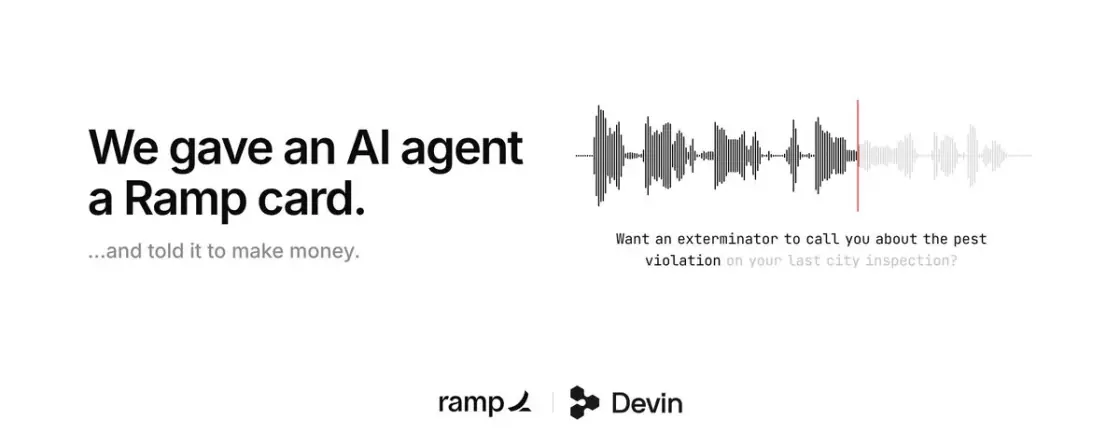
Make money, make no mistakes.
 Mo@atmoio
I’ve spoken to over 50 people 1:1 over the last several months to better understand how they code with AI.
It’s an absolute mess.
Here are the top 8 mistakes I see.
0:00 - Intro 1:19 - Mistake 1: Talking to 2026 models like they’re 2025 models 2:43 - Mistake 2: Devising funky…
 Jake Moran@jake11moran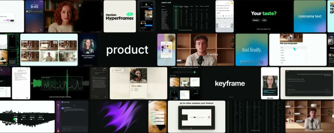
How I make launch videos with AI
Before you type, ⌘K shows five groups: Go to, Browse, Recent saves, Actions and Try searching. The arrows walk across all of them.
Every page is a stamp on a cutting mat. The perforation is a mask cut out of the mat, so the mat shows through every hole. The edge is four strips that catch pointers, never one window-sized layer with a hole in it: Safari routes a scroll by a layer's box and ignores its clip.
The mat and the stamp are 100dvh tall, so they follow the window when iPad Safari's toolbar collapses. On a touch screen the canvas behind them is paper and the paper's lift is dropped, because a fast fling paints unfinished tiles in the canvas colour.
Under 1100px, or on any touch screen, there's no slide-over: a row on /tools or /sites opens the entry's own page. This screen, right now:
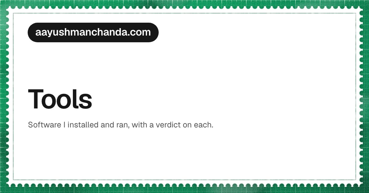
A shared link shows the stamp too: the domain in an ink pill, the section in a chip of its mat's colour, the title, and a picture when there is one. Sized to read on a 300px message card.
If the code and the contract disagree, fix whichever is wrong, in the same commit.
The contract is design.md, in the repository. This page is the half of it you can press.